I delivered customer-facing features for a major product release in collaboration with a senior interaction designer.
Successes
- Entrusted with designing two features for product releases throughout my term due to my ability to quickly adapt to a highly technical domain.
- Smooth collaboration with product team, setting expectations frequently and clearly to reduce miscommunications and manage deadlines effectively.
- Learned how to apply user research methodologies and generate design recommendations through collaboration with UX researcher.
The Problem
Network engineers must create contingencies in the event of network failure to avoid causing cause disruptions to internet service for customers. Since networks can include up to thousands of objects, simulating and analyzing failure scenarios one at a time is extremely time consuming and creates a large margin for human error. This is where our product, IP/MPLS Simulation, came in.

The Tool
The IP/MPLS Simulation web app is a sandbox that network engineers can use to import a version of their network, play around with configurations and simulate what-if scenarios to guide contingencies and optimizations.
I designed the Worst Case Failure Scenarios tool for IP/MPLS Simulation, which allows engineers to choose any number of objects in their network and generate scenarios to see the consequences of that object failing.
Primary User Needs
There were two main user values that became the guiding principles for my design decisions.
01 / Reduce the margin of error while analyzing data.
Data is displayed in a simple table organized into relevant categories of information. Infotips are used where necessary for improved readability and understanding.
02 / Free up time for engineers to spend on other tasks.
Automating this task frees up engineers to work on other tasks, allowing them to get more done in the same amount of time.
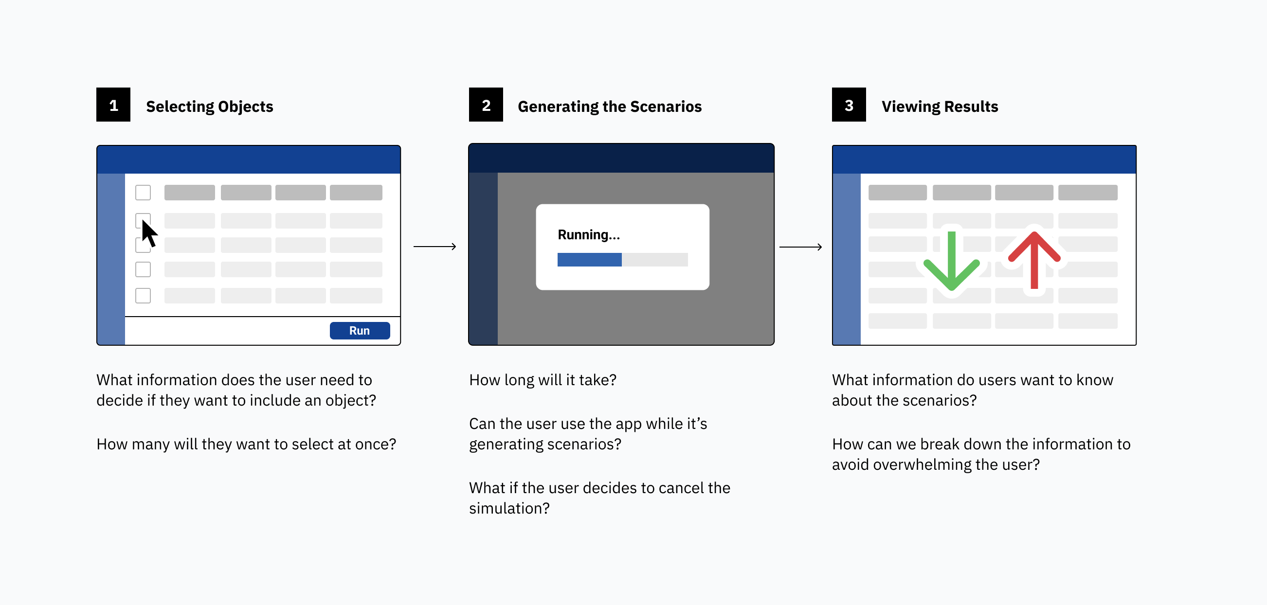
Preliminary Explorations
I started by facilitating a meeting with the developers, QA, and product manager, to align everyone on the general functionality. I recorded requirements from the meeting to keep me on the project road map as I began my design explorations.
Breaking down the flow into three chunks allowed me to understand the user’s perspective and thoughts at different stages of the process. I presented a preliminary navigation chart to the product team, which kept the team informed about my progress and generated discussion. This resulted in feedback that helped direct my next round of iterating.
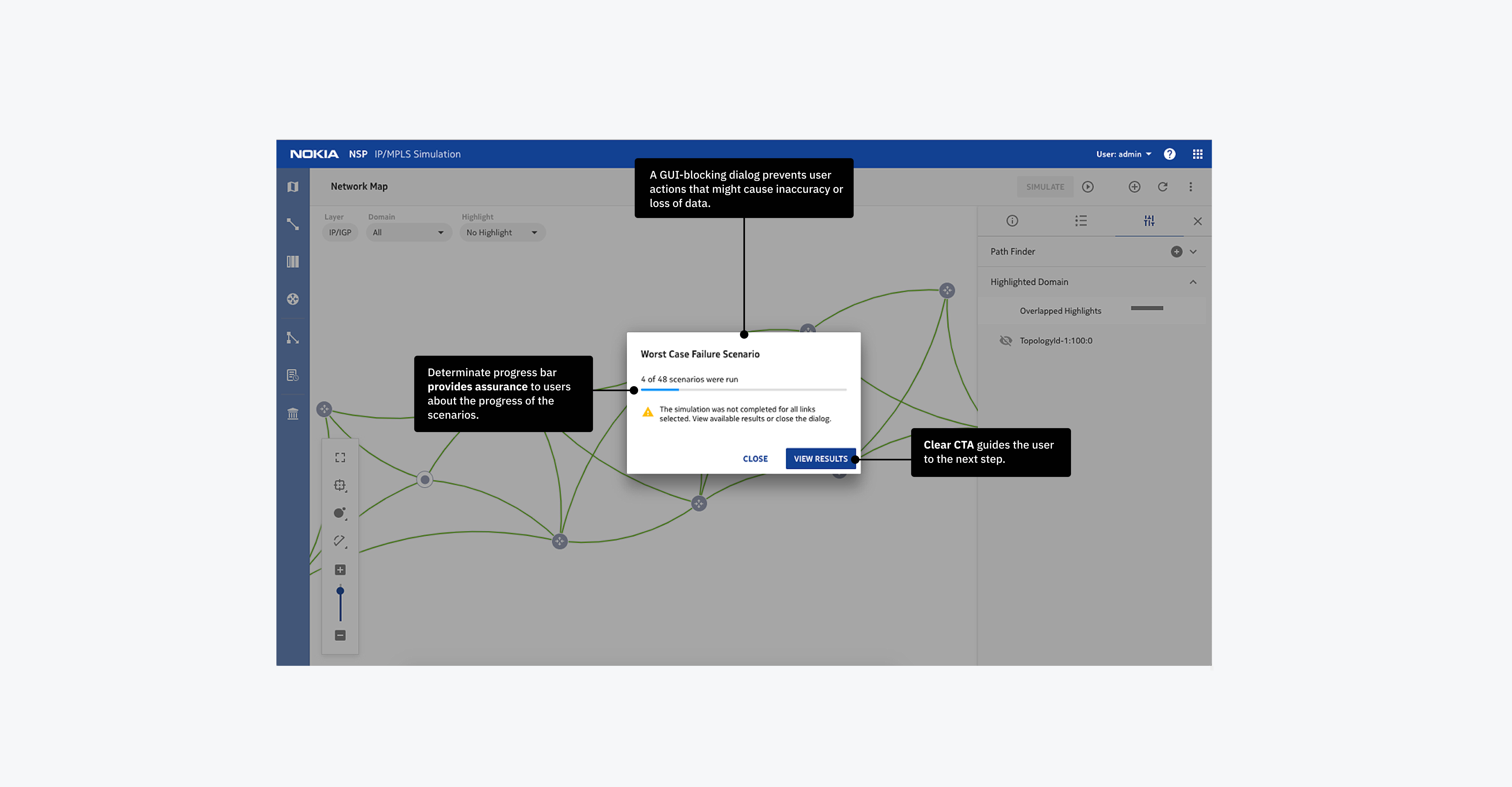
Running the Scenarios
Since the scenarios could take hours to generate, I considered the experience from the user’s perspective to identify pain points that needed to be addressed, and in what order of priority. The most critical pain point was any outcome where the user would have to run the scenarios all over again, possibly due to lost or corrupt data. How might we make the waiting stage simple and painless?
Solution
A GUI-blocking dialog prevents user actions that might cause inaccuracy or loss of data.
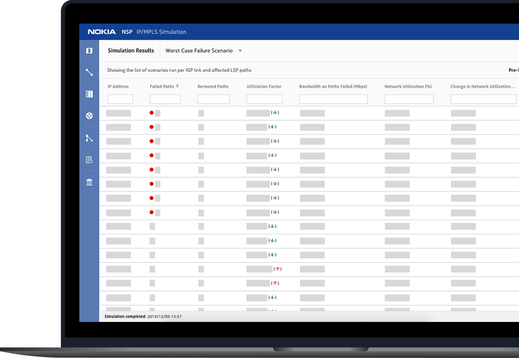
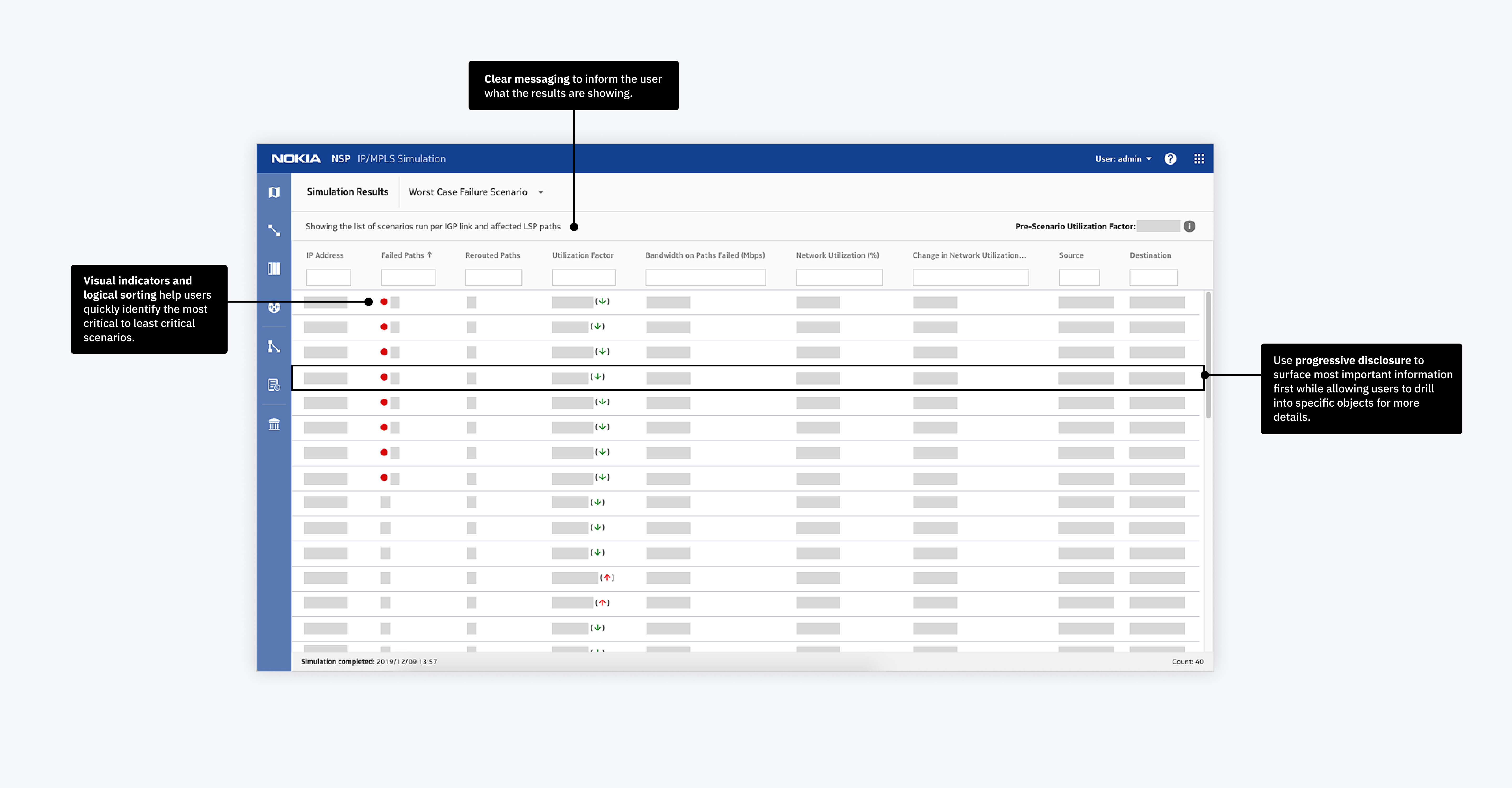
Viewing Scenario Results
I consulted domain experts to learn what data our domain expert user needed and why. Because different users may have different requirements, my goal was not to give them the “right” answer. My goal was to make the data accessible so they can easily find what they need when they need it. How might we take a large amount of data and make it accessible?
Solution
The large amount of data is broken up into two levels: a big picture view sorted by most critical to least critical scenarios, and a detailed view for advanced troubleshooting.
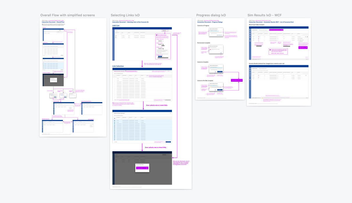
Evolving design and documentation
After reviewing the initial design with the team and incorporating their feedback, I produced interaction flow charts with detailed specs. These documents were constantly evolving as the product team moved from one iteration to the next. As project road markers moved or changed, I updated these documents to provide a single source of truth for the product team.
Reflection
A major challenge was putting myself into the user’s shoes. As a design student, I was as far away from our intended user as you could get. For me, an interface full of technical jargon would be overwhelming and confusing. For our user, it might be just right. I continuously improved my understanding of the domain by corresponding with domain experts on my team.
The more I learned, the more I began to empathize with our user, allowing me to strike a balance of designing for general usability versus the specialized needs of our extremely technical expert user.
This experience gave me the confidence to know that no matter what domain I step into next, I have the problem-solving and troubleshootings skills necessary to adapt and empathize.